
The idea here is to turn each <td> in <t> of <tbody> into one line so each <tr> will be a block. The css below will help you do that.
1 | td { |
Next we need to remove <thead> in mobile and convert it into a label in each <td> by using attr() method in css.
1 | td:before { |
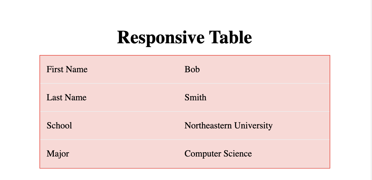
This is a demo